Even if you don’t know him by name, you definitely recognize his work. Paul Rand has steadfastly proven to be one of the most famous and lasting graphic designers in the world. His impressive portfolio displays the corporate logo work for which he is most known for. ABC, IBM, and UPS are just a small example of the many clients Rand designed for.
Paul Rand was born on August 15, 1914 as Peretz Rosenbaum in Brooklyn, New York. From an early age he showed interest and talent in the artistic field, painting signs for his father’s grocery store and for school events. His father disproved of his desire to work as an artist, thinking that would be insufficient to provide an adequate living. Despite his father’s misgivings, Rand attended night classes at various art schools, honing a talent for graphic design.
Rand’s first job in the graphic design field was as a part-time stock image creator for a syndicate. As his portfolio grew, he ultimately earned his most long lasting legacy through corporate logo work.
UPS logo – Designed in 1961
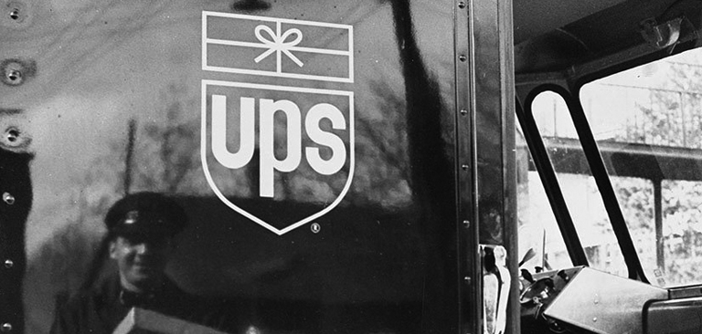
“I do not use humor consciously, I just go that way naturally. A well known example is my identity for United Parcels Service: to take an escutcheon – a medieval symbol which inevitably seems pompous today – and then stick a package on top of it, that is funny.”
-Paul Rand
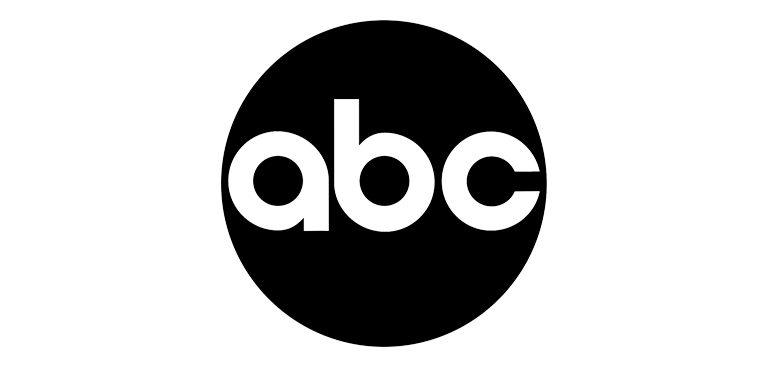
ABC Logo – Designed in 1962
“Don’t try to be original. Just try to be good.”
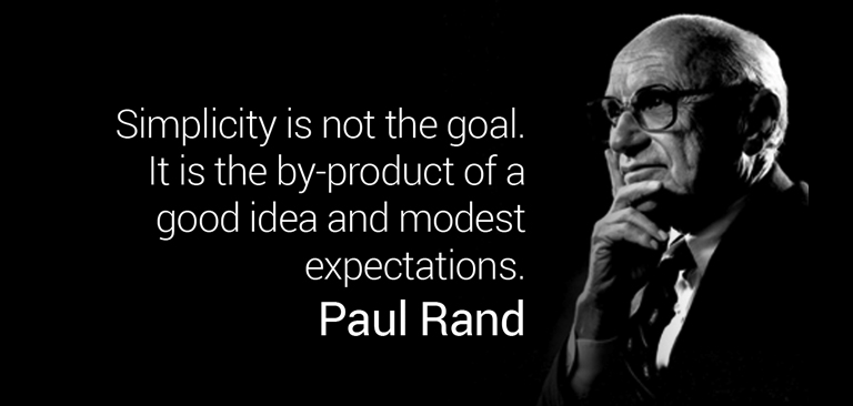
The fact that many of Rand’s logos were so simple, yet so impactful shows a very important lesson – sometimes less is more. His designs were not complicated, and that is what made them so beloved and long lasting. In his own words, “Simplicity is not the goal. It is the by-product of a good idea and modest expectations.”
Cummins Logo – Designed in 1962

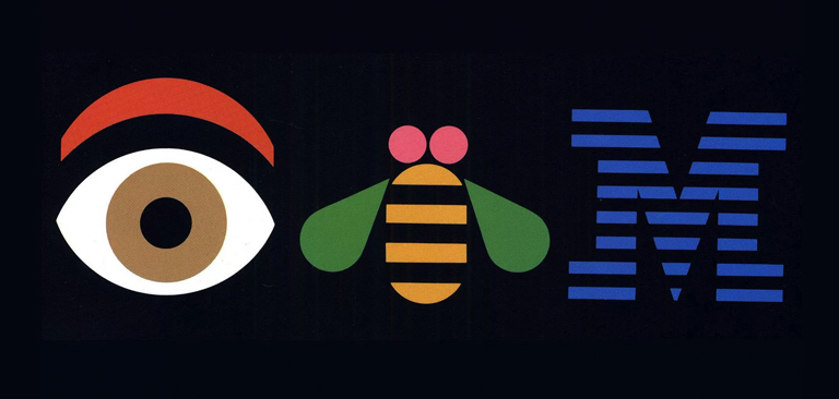
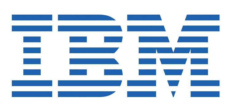
In the decade following the end of the Second World War multinational corporations started to spring up. The corporate identity business became the fastest growing and most lucrative graphic design specialty in the world. Not only did Rand create the striped IBM logo, but he designed packaging and marketing materials for IBM from the early 1970s until the early 1980s, including the well known Eye-Bee-M poster you saw at the top of this blog post.
IBM Logo – Designed in 1956
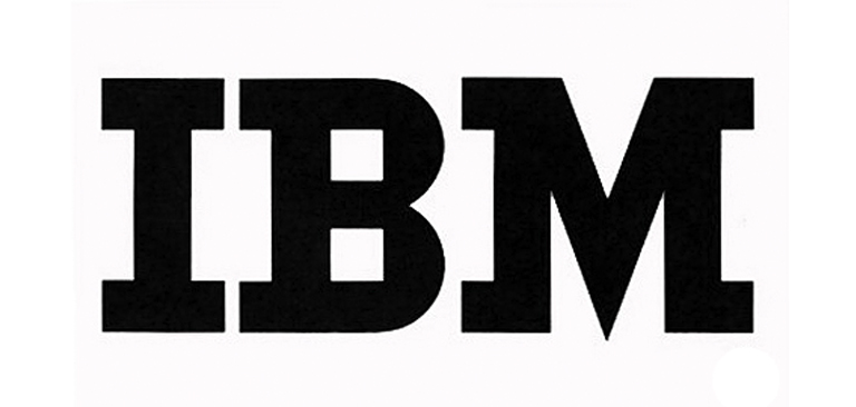
and IBM redone in 1972
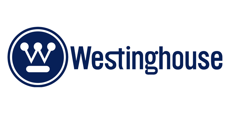
Thanks in part to Rand’s visual identity, Eliot Noyes, (The Director at IBM) was a huge success at IBM, and in 1959 he was poached by electric conglomerate Westinghouse. Noyes, understanding the need to revamp the ailing company’s visual identity, again turned to Rand, who modernized the existing logo by creating a design that suggested the interlinked points of a circuit board. Rand’s Westinghouse logo remains untouched, as fresh-looking now as it was when first designed more than 50 years ago.
Westinghouse Logo – Designed in 1960
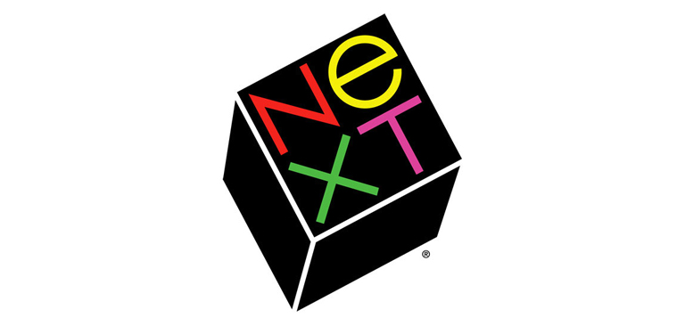
Rand continued doing what he loved until he died in 1996 at the age of 82. One of his last designs he did was designing the logo for NeXT, an acquisition of Apple. He billed Jobs $100,000 for his services. In return, Rand presented Jobs with a single finished logo. Accompanying his design was an intricate report explaining the rationale behind it. Jobs thought it was perfect.