As you can imagine, color is a vital part of branding. People are more likely to remember the color of your brand first than anything else and can affect how they feel towards a company so keeping your brand colors consistent across digital and print is crucial for brand recognition.You can use these tips here to keep your brand colors consistent!
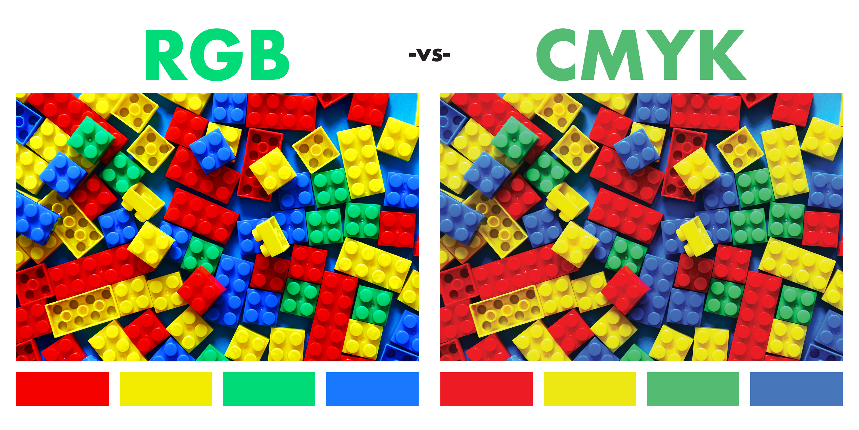
BE SURE TO DESIGN IN CMYK
Keep in mind that what you see on your computer monitor or phone screen and what comes out of the printer are completely different, the reason for this is because monitors and other digital devices use RGB (red, green, blue) and tend to be more vibrant than print. Printing, on the other hand, uses four color process known as CMYK (cyan, magenta, yellow, black) these colors tend to be toned down. If you create your design in CMYK from the start, you will be able to see more realistic colors achievable in print, vs using RGB which can use neon colors that will come out much more toned down when printing.
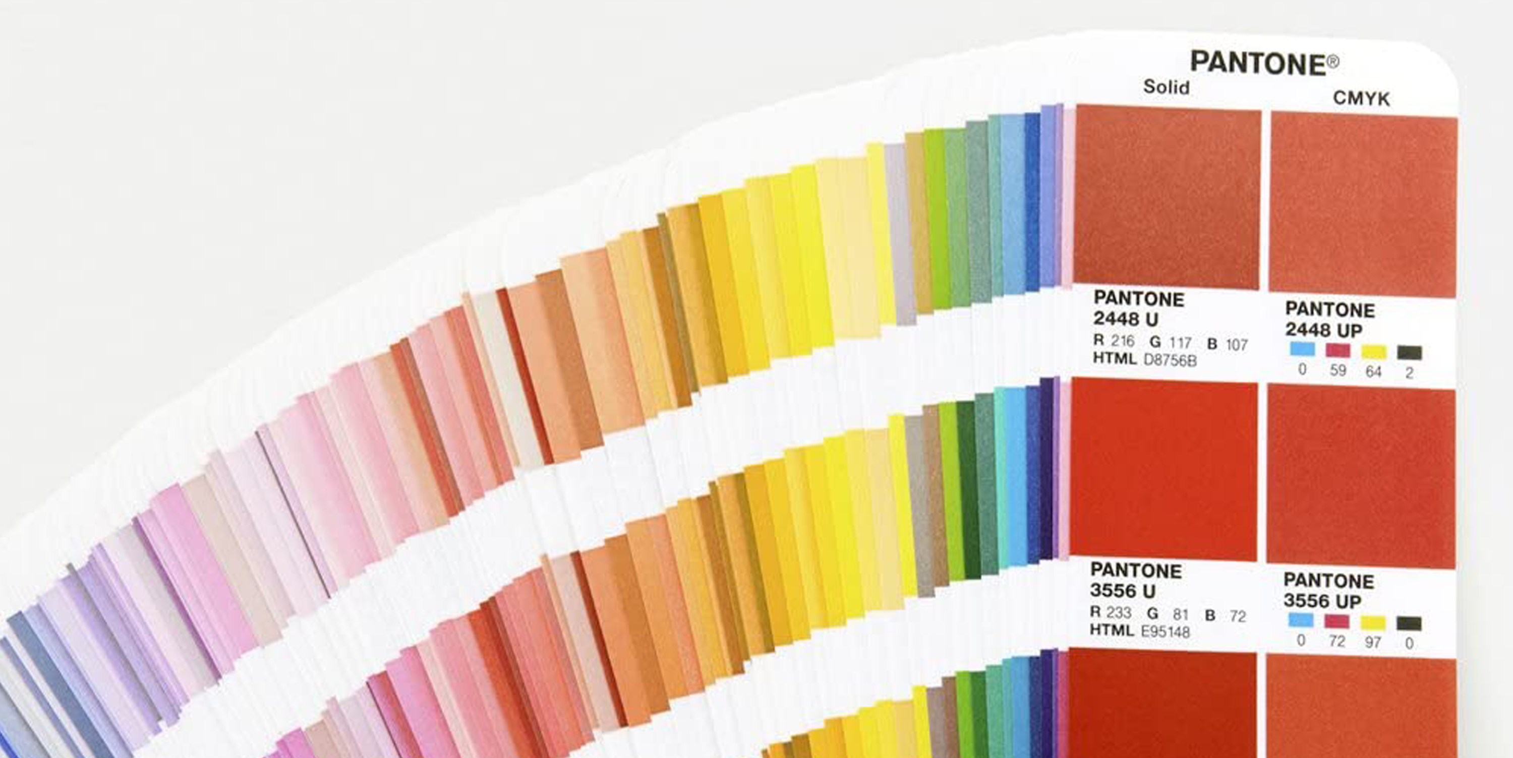
USE PANTONE SWATCH BOOK
We recommend you try using a Pantone swatch book, these colors are based on a Pantone Matching System (PMS) which ensures no matter where it’s printed, the color on the screen and the color which comes out of the printer will be the same. Also try to choose a Pantone that has a close CMYK equivalent, that way your brand color will look very similar whether you’re printing in Pantone or CMYK.
TESTING AND COLOR MATCHING
Always test your colors first or get a proof before printing! There are many factors that may change the appearance of your color such as paper types, finishes, and printing methods even if you’ve already printed in the past, test first. We offer FREE printed proofs, please click here to order.

Save 10% On Your Online Order!
93351PDC22
Copy the coupon code above to use at checkout.
Coupon Valid October 11 – 17, 2022
One coupon per order, single use | Valid on new online orders only, non retroactive | Cannot apply to custom quotes | Max discount $100