Have you ever seen a blue on screen that just didn’t print like you thought it would? Be very careful when creating blues for print. The range of colors that can be reproduced in CMYK mode is considerably smaller than the RGB range of colors reproducible on a standard monitor, so when the file it rendered to CMYK for printing, the colors may shift and lose vividness.
Printing presses, desktop printers and monitors produce colors in different ways. Screens and presses are NOT made to match each other, even if they sometimes do. Monitors use the RGB (red, green, blue) color model, which usually supports a wider spectrum of colors. Printers use the CMYK (cyan, magenta, yellow, black) color model, which can reproduce most—but not all—of the colors in the RGB color model.
Depending on the equipment used, CMYK generally matches 85–90% of the colors in the RGB model. When a color is selected from the RGB model that is out of the range of the CMYK model, the application chooses what it thinks is the closest color that will match. Programs like Adobe Photoshop will allow you to choose which color will be replaced. Others may not
Another issue we often see is a piece was designed using Pantone Colors but is being printed in CMYK. It’s a good idea to purchase a Pantone Color Bridge so you can see what might happen when the colors are converted form Pantone to Process CMYK. If you start designing in CMYK using the Color Bridge as a reference, it will make your life a whole lot easier! Take a look at these examples of blue color mixes.
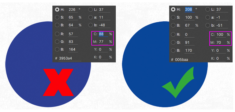
For most predictable outcome keep you Cyan and Magenta at least 30 points apart. You can see how less than 30 may go purple.